Uses R Statistics to display the colored correlation plot - correlogram- in corrplot.pdf
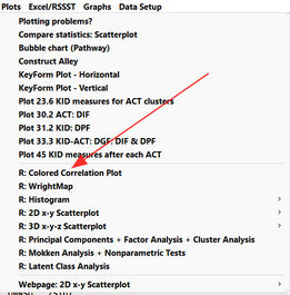
From the Plots menu:

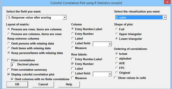
The Colorful Correlation Plot dialog window:

![]()
Option |
Description |
Select field: 7. Standardized Score Residual |
Numerical data accepted. |
Persons are rows, items are columns Persons are columns, items are rows |
The columns are treated as items (variables) in this analysis. |
Omit persons with missing data Omit items with missing data Keep persons/items with missing data |
Missing data is allowed |
Column labels |
Shown in plot |
Row labels |
included in R data frame but ignored for correlations |
Print correlations |
A correlation matrix is displayed in the R analysis window |
Decimal places |
Number of decimal places to be shown for each correlation |
Print correlation summary |
A few summary statistics of the correlation matrix |
Display colorful correlation plot |
Plot is shown in an R Graphics window |
Omit columns with no finite correlations |
missing and incalculable correlations are shown as blanks spaces. Blank rows and columns can be hidden from the display |
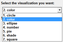
Select the visualization you want: |
The colored shape in the correlation matrix plot |
Shape of plot |
Shape of the displayed correlation matrix: Full, Upper Triangular, Lower Triangular. |
Ordering of correlation rows in plot |
For technical details, see An Introduction to corrplot Package |
Show values in cells |
Also displays numerical correlation in each cell |
Output from R Statistics:
Correlation matrix:

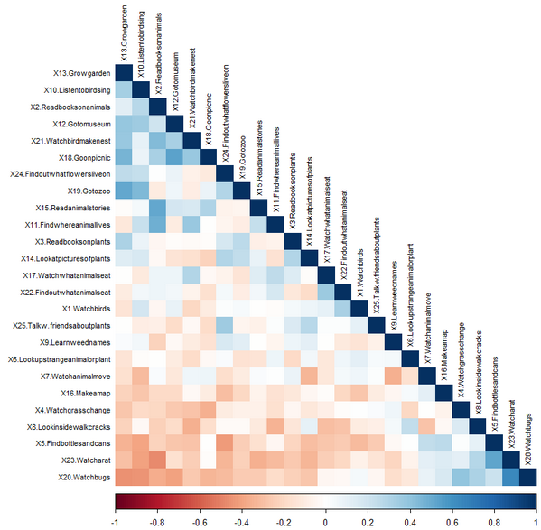
Colorful correlation plot - visualization "color" with option hclcust so that similar correlations are clustered together.
:

